The ’60s and ’70s had a distinct feel when it comes to text treatments. Here’s how you can achieve that vibe.
When we think about films from the 60s and 70s, characteristics that come to mind include celluloid film stocks, lens choices, music, and somewhat melodramatic acting. However, another defining genre convention of the era is the titles. Film titles from the ’60s and ’70s have a distinctive feel; often, it almost seems as if they are of an organic nature — as if they are alive. This is because they were often filmed and animated either by machinery or by hand. As a result, you often see slight wiggles, grain, and halation seep through into the text.
Today, using a handful of built-in plug-ins, let’s explore how you can achieve this effect.
Creating Halation and Color Effects in After Effects
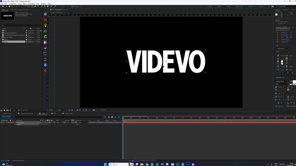
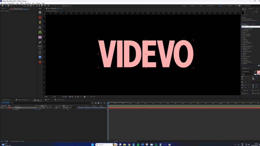
While the font choice doesn’t overtly matter, I find that using a font from the time helps sell the effect a bit better than using a modern font.
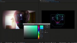
First, we need to consider the color of our text to create halation. If you’re not too sure what that is, halation is the glowing outline around bright light sources or highlights in an image. We don’t typically see it in digital formats much, but in film, halation happens when light passes through the emulsion layer of the film, reflects off the base, and then spreads back into the emulsion, causing a blur or halo around bright areas.
In After Effects, you don’t actually have a halation effect, but there’s an easy way to simulate one.
With our text selected, we want to change the color to a soft pink or orange—the colors you’d see with halation.
Then, we’re going to add a basic glow effect to the text layer. In one of the rare instances, the default glow settings are actually decent enough. As we zoom in, we can see the underlying color of the text layer start to creep out.
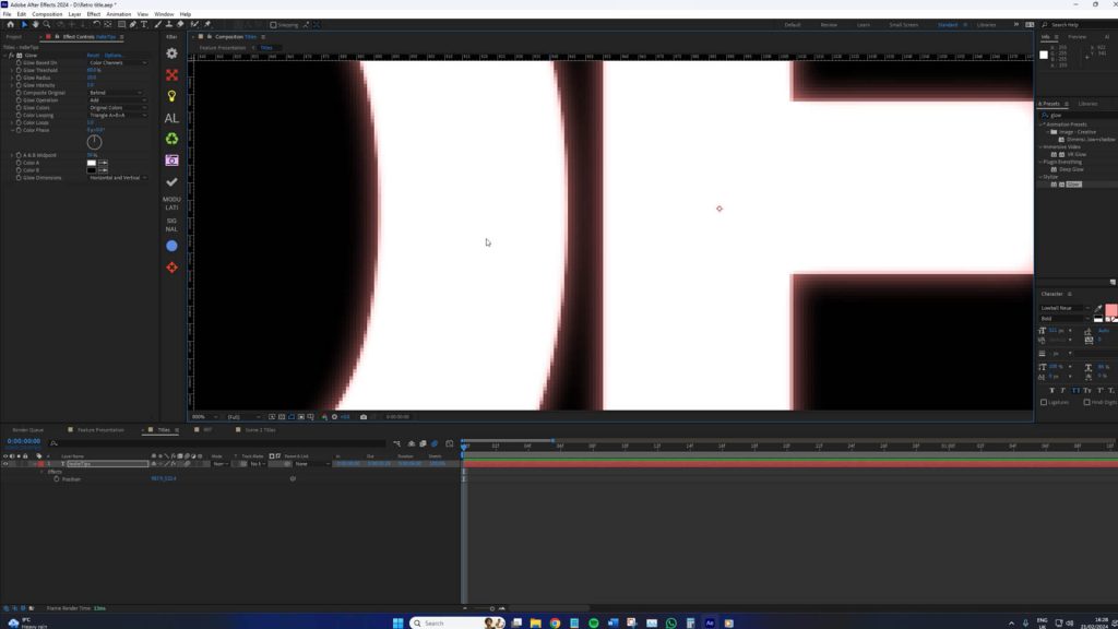
This now bears semblance to halation. We could further emphasize the effect by increasing the glow radius, but you only want to do this slightly. In my example, I will increase the radius from 10 to 18 to make the halation slightly more apparent.
Now, back in the ’60s and ’70s, given that the text was handcrafted, then filmed, transferred, printed, and then projected at the cinema, the text was very rarely as sharp as we’d see with the likes of After Effects.
Therefore, add a Gaussian blur and increase the blurriness from 5 to 10. I’ve settled on a level of 6.
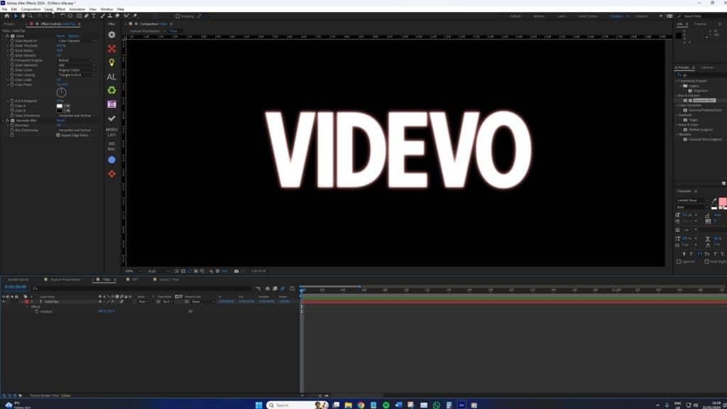
This looks great!
Adding Authenticity with Grain and Movement
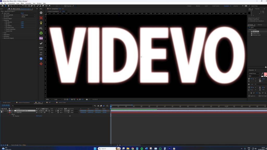
Next, we’re going to add an adjustment layer and then add grain. The reason for using an adjustment layer rather than applying it directly to the text itself is that grain can severely affect the performance of your system. And if you’re adding this text to a larger group of animations, you might want to turn off the grain. If it’s tucked away within the text’s effects control panel, it can be a bit tedious to turn off and on. Therefore, an adjustment layer will allow you to turn off the grain in one hit. However, ensure to set the adjustment layer with adequate matte settings when working on a larger composition.
With the grain effect added, change the settings to the following:
- Viewing Mode: Final Output
- Preset: Kodak Vision 250D
- Intensity: 0.700
- Monochromatic: On
This will give the text a film-like appearance. Even static, we can subtly see a level of movement within the text.
However, the movement can always be exemplified with the wiggle expression.
To do this, press P on the keyboard to bring up the position and hold alt while pressing the stopwatch icon. Here, write wiggle(15,1). This expression causes the position of the text layer to change randomly 15 times per second within a range of 1 pixel in any direction, creating a subtle but dynamic movement reminiscent of the slight instability seen in vintage filmed text.
The finished result is pretty compelling (check the video for the animated results).
Additional Steps
If your primary goal was to create 70s-looking film text, then, well, you’ve done it. However, we can go two steps further.
The first is to find a retro-looking background asset from the Videvo library. There are tons to choose from! Just be sure to add some flickering film grain (also found in the library) to seal the effect.
The second is to implement the advice presented in a recent Freepik tutorial. The folks at Freepik recently produced a tutorial that shows you how to display echo trails on text in After Effects.
This, too, is a staple of ’60s and ’70s text, and when combined with the advice from this tutorial, you can create some realistic-looking vintage text.
Looking for filmmaking tips and tricks? Check out our YouTube channel for tutorials like this . . .