When building a video project, the colors you use signal the mood of your project. You can alter the emotional impact of every scene simply by altering the colors.
Color has been recognized for centuries as being more than a pretty way to dress up a room. Early medical documents from China note the use of certain colors in healing practices, and the ancient Egyptians practiced streaming sunlight through various colored crystals as part of holistic cures. As the Western world rallied behind Isaac Newton‘s discovery that white light contained all the colors, artists, scientists, and philosophers became fascinated with the impact of color on our psyche. During the later part of the 20th century, Carl Gustav Jung, Swiss psychiatrist and founder of analytical psychology, explored the use of color in psychotherapy.
What does all this mean for filmmakers? In short, you can you change someone’s mood by featuring certain colors in your production design.
Let’s take a look . . .
Red: The Color of Attention
Of all the colors in the rainbow, red is given the premier spot in its ability to influence a viewer. Why? Mostly because it stands out. Our world (the natural and the unnatural) tends to be uniformly blue and green, which makes red stand out against this background. It’s one of the three colors that make up the primary colors triptych (the basis for every other color) since these are the colors that the cone cells in our eyes can readily see.

As such, red is meant to be arresting. It’s meant to be exciting. It’s meant to get your attention. Traditionally, it’s meant to signify danger or a critical imperative. Stop here! Look at me! Focus your attention on this spot. There are some studies that suggest that red derails us from our train of thought, that we are more likely to be distracted by the presence of red. Our control slips. Our passions ignite. It is the longest wavelength of visible light, just below infra-red — which can’t be seen, but which we can feel as heat. Therefore, because we are simple creatures, red means heat.
The Limitless Depths of Blue
Blue is at the other end of the spectrum from red, and conversely, is considered cool to red’s fiery passion. Blue wavelengths are scattered more readily, which is why the sky and the sea appear blue. In the ancient world, you had to crush lapis lazuli in order to make blue pigments. It occurs naturally, as indigo, but the plant flourished mainly in the Indian subcontinent, making it a highly sought-after trade item in Europe. In fact, production of indigo in the American colonies was significant enough that barrels of it were traded with the French as part of the effort to fund the revolution.
Oddly enough, for all the soothing and comforting feelings that blue promotes, blue pigments are known to be toxic and deleterious to one’s health. It wasn’t until the discovery of YInMn Blue in 2009 that a safe pigment was discovered.

Because blue is all around us, it becomes background. It becomes the infinite horizon. It becomes calming and comforting. It is heavily used in the stained glass windows in European churches, and in the 12th century, the Roman Catholic Church dictated that the robes of the Virgin Mary must be blue, thereby elevating the color to indicating saintliness and holiness (a decree which culminated in Titian’s Assumption of the Virgin, the 16th-century altarpiece in the Basilica di Santa Maria Gloriosa dei Frari, a painting whose rich colors have recently been restored).
The Grass Is Always Greener
In the childhood mnemonic ROY G. BIV, green is a lone middle initial that is never defined. Green is neither hot nor cold; it’s the middle child. The one who doesn’t fuss or draw attention to itself. It’s the peaceful one who gets things done, quietly and regularly. While some might think that makes green boring, think of it more as dependable. Green will always be there for you, and in many instances, it is used to symbol that constant cushion. In the spring, the natural world turns green, leading us to consider the color as symbolic of renewal, health, and fertility.
In some cultures, especially the ones that equate wealth with power, green is the power of money. This green is a sickness, an aberration. It is, in the words of the wise English bard, a color only worn by fools as it is a cloth of envy and jealousy.
It’s trickier than red and blue because it has these divergent meanings, which is why we have sixty-three thousand variations. Put a little more blue in your green and it’s a cooler color. It becomes more welcoming and relaxing. It’s the “green room” color, that backstage room meant to be a calming influence before you go on stage. Add a little red and it warms up, transforming into a more passionate color — a tone that suggests a more emotional reaction.
Nothing Like the Sun
While our eyeballs work with red, green, and blue, yellow is still considered to be one of the primary colors, in that it is a color from which all others can be sourced. Yellow lies between red and green, and it readily steals from both. It is both warm and comforting. It is illuminating, and if we look back at Titian’s Assumption of the Virgin, we can see that it is the color radiating from heaven — that holiest of lights. Yellow makes us happy. Yellow is the color of things happening, that first flare of creativity when an idea sparks into life.
But, like green, yellow can also have negative connotations. It can suggest ill-health, fear, and anxiety. Use care when you mixing it into your color palette.

As Pure as the Driven Snow
In the late 17th-century, Issac Newton was busy quantifying all sorts of principles that would go on to form the basis of modern Western physics and mathematics. Along the way, he published a book called Opticks, which detailed his experiments with light. He demonstrated that white light could, with the use of a prism, be expanded into the visible spectrum. Out of one sprang many, so to speak, making the color “white” the absence of other colors.
In this regard, white is a negative space in your palette. It is nothingness, which can be read as both purity and sterility, innocence and emptiness. In much the same way that red draws the eye, white can as well, but purely because it is a lack of color. Think of it as a negative space in which your audience will put all sorts of ideas of their own.

The Dark Parts of the Night
Conversely, the color black is the presence of all the colors, all at once. If white is the emptiness in which anything can be imprinted, black is the depths in which anything can be hidden. We don’t know what lies in the dark center of those shadows; thus, all we can do is dream up the things that hide there.
Why do we think that nothing hides in the white and that all sorts of terrible things hide in the black? Who knows, but it probably has something to do our steadfast reliance on the sun for light and warmth. In filmmaking, black — much like white —is used to frame scenes and images because it helps to create an illusion of space. It symbolizes an untapped depth, a vast reservoir of power and seriousness. You can’t fathom how deep this well goes, dear friends, but it goes all the way to the bottom.
As you put together your next video project, keep in mind these core principles of color theory, and make sure you use these palettes to enrich your visual presentation.
Looking for filmmaking tips and tricks? Check out our YouTube channel for tutorials like this . . .
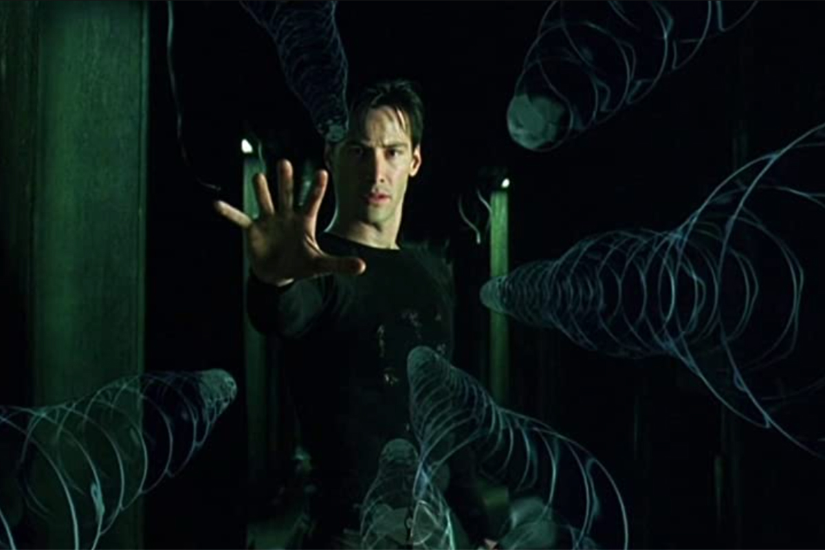
Cover image via The Matrix (Warner Bros.).
Looking for more tips and tricks? Check out these articles . . .