The director controls everything the audience sees, as well as everything they feel. Using the right colors can do some of the heavy lifting for you.
As a director, you’re in control of every aspect of what appears on the screen, and one of the things that separates the student making their first digital short and the auteur is the director’s use of color. Back in the day, directors worked with light and shadow, and they endlessly fussed about whether taupe or ecru gave you the softer white under-lights. However, with digital technology, you can record more colors than you can count; the trick is not getting lost in the plumage of the peacock.
We track colors that stand out. We have an emotional reaction to certain colors. We imprint images more readily when they are strikingly composed. Think like a director, and use the color wheel to influence your audience.
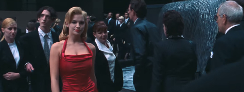
The Red Dress
We all remember Neo’s introduction to the Matrix in the first of the Wachowskis‘ films that challenged our perception of reality. Morpheus drops Neo onto a city street overflowing with pedestrians. They’re all wearing either black or white. Mostly office drones. A few sailors. A woman in a wedding dress (who doesn’t stick out as much as you would think because she’s matching the color tones of everyone else). The walk sign is green. Some of the buildings are green. Then, parting the crowd like a laser is a woman in a red dress. As she walks by, Morpheus asks, “Were you listening to me or were you looking at the woman in the red dress?”
What do you think?
Here’s the real trick, though. That scene opens with a shot of the street crossing sign, which is a red figure. It’s almost like the Wachowskis were setting us up, weren’t they?
The Emotional Impact of Color
We’ve been studying how color affects our moods and emotions for hundreds of years. Johann Wolfgang von Goethe, when he wasn’t busy writing about deals gone bad, spent his time categorizing and theorizing about color. In his Theory of Colours (first published in 1810), Geothe proposed one of the first examples of the color wheel, placing colors in opposition and symmetry with each other. He even went to so far as to apply some aesthetic qualities to the colors, laying the groundwork for color psychology. So, yes, the same guy who popularized the “Deal with the Devil” story framework is also responsible for why Ronald McDonald wears red and yellow (Goethe classified these two colors as “beautiful” and “good,” respectively).
Both Tony and Ridley Scott are masters when it comes to filters, and their films are awash in gradients and color washes that the rest of us can only dream about. Tony — especially in his later films — began to experiment with using heavily saturated color tones and extreme lighting to subtly influence the viewer’s emotional reaction to a scene. It is with Domino, his 2005 film starring Kiera Knightly and Mickey Rourke, that he hits his experimental peak. The film is framed with an interview scene between Kiera Knightly’s Domino and Lucy Liu’s interrogator, and Scott lights the scene in deep greens with flashes of red and yellow. Why? Because we’re supposed to believe Domino’s version of her story. All the colors say “noble” and “good” and “helpful,” and even though Domino is a bloody mess and her body language says “I’m a rebel who doesn’t have time for the law,” we’re supposed to trust her.
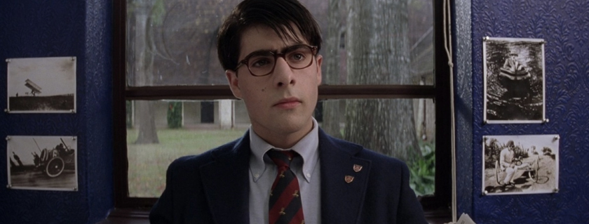
Other directors are both more restrained and more overt with their use of color. Wes Anderson, for instance. While we associate a certain font and a certain color with his films, we tend to overlook the consistency of the color palette used within a film. Bottle Rocket, his first film, establishes his predilection for red and yellow. He tries to avoid such overt signaling by using a more reserved palette with Rushmore, and his real masterpiece of color composition is The Grand Budapest Hotel.
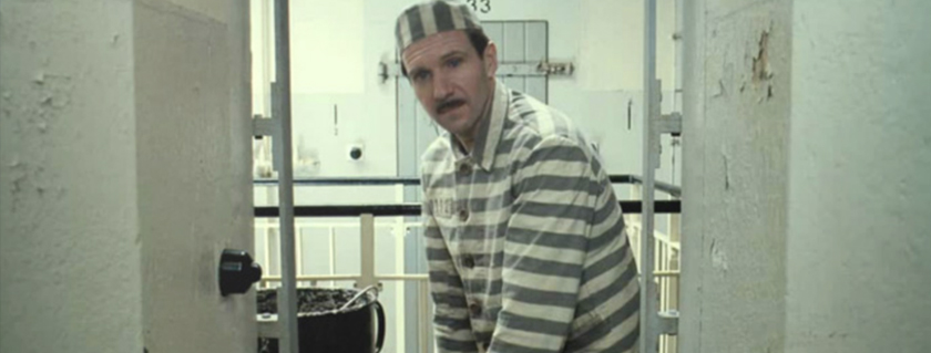
We could screenshot nearly every frame in that film and spend an hour dissecting the subtext of the color choices, but we’re just going to give you this shot of M. Gustave (played by Ralph Fiennes) in his prison stripes (as compared to the royal purple of his hotelier jacket), and let you take in the multiple shades of gray.
Color Palettes As Guideposts
Color can also remind you where you are in a story. Based on an Elmore Leonard novel, Out of Sight is a heist film wrapped around a romance between career criminal Jack Foley (played by George Clooney) and U.S. Marshal Karen Sisko (played by Jennifer Lopez). Director Steven Soderbergh presents the story out of sequence, and the way he keeps the audience grounded as he cuts between distinct points in Out of Sight is through his color palettes.
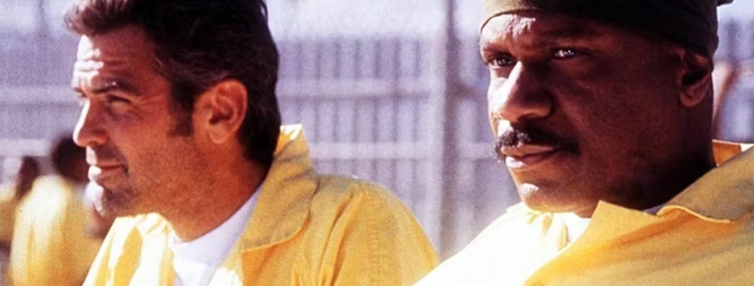
When we’re in Miami, everything is green and pink and slightly fuzzy from all the sun. The first time Foley is in jail, it’s all barbed wire and blue denim. The second time is yellow jumpsuits and white walls. When the story transitions to Detroit, the light gets cold and crisp, and the color tones are all dark blues and grays — steel and stone. The sequence with Foley and Sisko in the truck is all red, limning a space that is a special time out for our players. Adele—Foley’s sister—lives in an apartment that is green and orange, letting us know she’s part of the Florida setting, but she’s also set apart from everything else. Scenes with “Dick the Ripper” Ripley are varnished woods and soft lighting, a world apart from the cold briskness of gritty Detroit and the sun-drenched haze of Miami. A world where Foley and the other criminals are trespassers, where they are out of their element and where they cannot stay.
The Razzle Dazzle
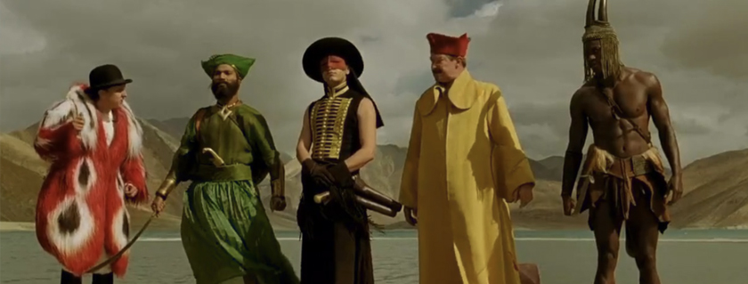
Tarsem Singh’s The Fall was largely unnoticed when it was released in 2006, and has only gained traction for its beautiful visuals and costumes on home video. The Fall is an exploration of the power of story, and each character is a vibrant archetype represented by a single color: the Indian in green, the naturalist in red, the armorer in yellow, the scout in brown, and the bandit in black.
Largely financed by the director himself and shot in over twenty countries, The Fall was produced without a reliance of color-correction and post-production effects. Singh believed a more natural presentation would age better. The result is a film that Roger Ebert lauded, saying, “You might want to see [it] for no other reason than because it exists. There will never be another like it.”
Though, ten years later, Damien Chazelle dazzles us with La La Land. In addition to heavily choreographed dance numbers and long tracking shots that will break your brain with their inventiveness, Chazelle continually hits color marks within each long shot. Freeze nearly any frame in the first hour of the film, and you’ll find yellow, red, blue, and green equally represented on screen.
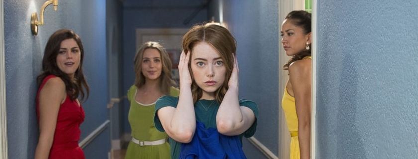
No, seriously. Start at the nine-minute mark and watch the sequence where Mia’s roommates entice her to come out with them. It comes off as a single take (with singing and dancing) through multiple rooms of their shared apartment, but each room is painted in a different primary color. As the camera and cast move through these rooms, each of the four roommates gets a moment of focus, and each of them is wearing a color that contrasts with their surroundings.
It’s a bit ludicrous in its showmanship, but at the same time, it’s a stark reminder that the director really can control everything the camera sees. And like the red dress in The Matrix, the question remains: What do you want the audience to look at, and why?
Cover image via Warner Bros.
Looking for creative assets, video overlays, or even video backgrounds for your projects? Check these out.
- The Sounds of Summer: 23 Free Assets for Podcasters
- Where to Find Assets for Your Creative Projects
- Summer Mixology — 21 Free Filmmaking Assets
Looking for some inspiration? Check out our Videvoscapes. Let your mind wander with hours of high-definition nature footage, background video, cityscapes, and more — and chill, downtempo tunes you can really think to.